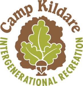
Revitalization of Camp Kildare
 Camp Kildare is located on five acres of wooded property with 360 feet fronting on Kildare River. It was originally opened in 1973 and has served as a camp for Scouts Canada as well as a venue for a variety of community events and private rentals. The Alberton Community Development Corporation (ACDC) recently acquired the property with the goal to renew the community spirit that Camp Kildare once generated.
Scheduled to open in 2014 as a seasonal, intergenerational camp its building is getting a major facelift and being promoted as “PEI’s newest waterfront camp”. I was asked to create a logo and rack card that would provide the basis for visual branding.
As I developed my creative brief for this project I came to appreciate the history of this camp and the passionate memories held by former campers. Over the years it has been a place where people of all generations could relax, revitalize, reconnect, be refreshed and just have fun.
 The logo needed to have a strong connection to PEI and the simple pleasurable experiences available at the Camp. The oak tree is iconic to the Island and represents longevity, stability and strength. Acorns symbolize potential, youthfulness and independence. Marrying together these attributes by using a oak tree, oak leaves and an acorn gave a solid foundation for Camp Kildare’s logo.
The mixed typography of forest, clearing and water frontage presents an idyllic setting in which to offer recreational activities for families, children, youth, seniors and groups. Rack card photos were carefully selected to quickly convey as much of this as possible.