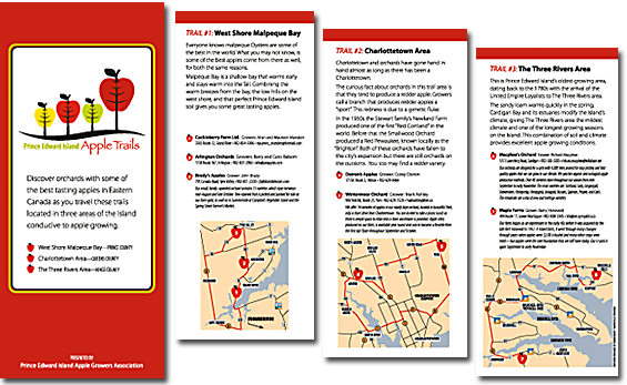
Apple Trails: logo and brochure
While looking out my window at boxes of apples from our orchard I was reminded that I hadn’t posted a brochure I was hired to create for the Prince Edward island Apple Growers Association. The goal was to promote all of its members as belonging to one of three apple trails here on the Island. Even though we’ve had a family orchard for thirty years I learned that there are some key areas on the Island conducive to growing apples–we just lucked out choosing where we did to live. My husband John is originally from the Annapolis Valley…I know, from away. He’s always loved working with apples.
Back to the the design project. The group had a limited budget, a tight deadline and also needed a logo! I was asked to have the logo use three trees, like in the provincial flag, but put apples on them. I accepted this as a guideline but worked toward creating a logo that would work regardless of size or use of colour and best represent them as quality apple producers.
In the process of doing my sketching and thumbing through tree images I came across a trunk that I really liked. Actually it turned out to be the veins and stem of a leaf. That gave me the idea of replacing what turned out to be a leaf for graphic apples. If apple trees had been used in the logo it wouldn’t have translated well when printed small or in black and white. Now there is no mistaking that “apple trees” are being depicted.
The base for the apple trees is a gentle flowing swoosh which represents the land, of course, but also a reference to the fact we are surrounded by water. Many times small groups and businesses want to use the map of the island on their sign or in their logo. It’s not necessary and can be very unappealing when used incorrectly. This logo wouldn’t have benefited from its use.
The logo was to be a key component in making the existence of three apple trails easily recognizable and memorable. The concept of trails had never been tried before and the brochure was to be the first step, reinforced with newspaper ads and radio promotion. Now came the challenge of representing each of the trails equally. The solution: single-fold, four panel, double sided brochure. The front panel explained the purpose of the piece. Each trail, was allocated one of the remaining three panels. The group had named each trail. A concise map rendering for each trail area was created. In order to maximize the benefits of the group having a brochure I encouraged the members to provide contact info for each farm and a brief description.
The digital proofs I sent out were heartily received and quickly approved. Kwik Kopy did an excellent print job, within budget and on time.
Leave a Reply
You must be logged in to post a comment.

