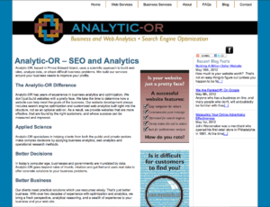
Time to rebrand
“Brand Identity” is what a business owner wants to communicate to their target audience, whereas a “Brand Image” is how your brand is actually perceived and recognized. A constant challenge is to have the two beneficially aligned. Your visual presentation plays a crucial role in your “Brand-Building” success.
 Analytic-OR has been an incorporated business since 2003. The “OR” stands for Operational Research and the company was focussed on in-depth business and web analytics. Over the years principals, Dr Jay Adamsson and Michelle MacDonald have expanded the services of Analytic-OR to become a management consulting and strategic communications firm. By bringing together multi-disciplinary teams they can now partner with clients in all sectors to tackle complex challenges to develop, as well as implement, practical solutions.
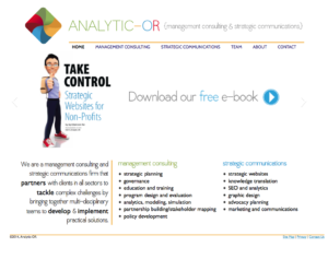
The original hard-lined, mathematical appearance no longer suited. Graphically Speaking was contacted as it was time for a total rebranding of Analytic-OR: logo, website, business cards, rack cards, signage etc. This post calls attentions to the logo and website.
 The new logo utilizes a modified pinwheel to represent the different areas of work being done, the multiple disciplines they bring together and the broad perspective of their firm. As a pinwheel it is evokes movement as they’re an action-oriented firm moving towards solutions for their client. The comes to a point in the center, reflecting they are client centered and focussed on results, but the ripple effect of the waves along the pinwheel speak to broader reach.
Four primary colours (red, green, yellow and blue) are used in the rebranding. Management Consulting and Strategic Communications are the primary categories of service. Green and blue have been respectively allocated to them to assist website visitors navigating through the extensive lists of services. The letters O and R in the firm’s name use different colours to assist comprehension that they are initials and not a word.
Fonts, images and layout were chosen to be professional but not intimidating. The rebranded site www.analytic-or.com is dynamic and friendly with a light airy feel, whilst being equally informative with in-depth articles backed by experience details. The definitive “calls to action” on the home page let visitors know that Analytic-OR is ready to work with clients to reach their strategic goals.