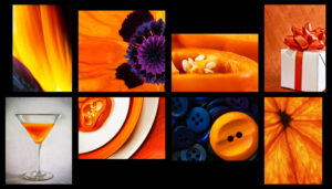
I’m seeing orange
 I belong to a photography club that meets monthly to learn about various aspects of the craft including techniques, software and equipment. There’s always a homework assignment based on a theme. Then, at the next meeting, we can each submit up too three images we’ve taken to share on the projector screen. I love the challenges this offers and my creative energies are on the lookout for ways to complete my homework.
A recent assignment was the colour orange to be interpreted however we wanted. I’m not a huge fan of that colour but I was up for the challenge. I noticed orange in more places than before ever before such as in logos, signage, clothes, accessories etc. There were so many variables to consider: composition, subject, image quality, target audience, etc. that when it came time to select my top three entries I found it extremely difficult to decide.
This photo shows a collection of some the images. What would you have chosen as your top three? (For a closer look click image to enlarge it.)