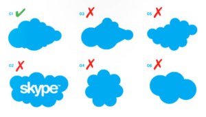
It’s worth protecting! Have you?
 So you have a logo that you’re happy to have represent your business or organization 24/7. That’s wonderful! And since your logo is so crucial to your branding it’s protected. Right? By this I mean you have some guidelines to make certain it’s used consistently—giving it substance, authority and the oh-so-necessary memorable quality.
Think about it. What if your staff or a service provider casually changes the appearance of your logo? Maybe they need it in B&W or made to fit in a limited size space. Every business has this challenge. Setting some guidelines is more a matter of planning and patience not money, yet it’s an essential step in maintaining a professional brand.
Let’s look at the familiar Skype logo. How can one mess up using it? So the cloud changes a wee bit—a lighter shade of blue or the cloud’s shape gets tweaked to fit a space—no big deal!
 Indeed it is the beginning of a slippery slope for its visual identity.
The Design Talk article Your logo as a design element explains further the importance of logo consistency using examples of companies like Target, UPS and GE.
Having guidelines for using your logo on products or in promotions can be concise or extensive but they need to exist in some form.
The article Brand Identity Style Guides from Around the World lists a wide range of style guides from which to get ideas.
By guiding your logo’s use you’re guarding its visual strength and your brand identity. Got questions? Contact me.