Spray and Pray
A strange title isn’t it? The credit for this expression goes to Kris Kiler president of Strategic Marketing Systems. In one of his emailouts he described the concept of creating a prospect profile as “a critical step to understanding who you want to market to as opposed to who you end up marketing to.” He says that you must focus your efforts because “spray and pray marketing” doesn’t work!
I really like this little phrase “spray and pray” because it speaks volumes not only in reference to marketing but also to a company’s visual voice. This encompasses every visual your company uses to convey a message both in print and digitally: logo, colour scheme, typeface, packaging, imagery etc. You have to know your target audience. It’s impossible to convey a message effectively if you don’t know who you are addressing. And if you don’t then it’s important to figure it out in order to meet their needs.
Consider now a task we all perform on a daily basis: selecting what to wear. Many factors play a role in our decision making in order to dress appropriately. You’re favourite sneakers, though very comfortable, would not be the wise footwear choice if you’re a lawyer about to present in court. They would affect impressions of you as a professional.
The same thinking holds true for your company’s brand. Who do you want to speak to? What do you want to say? How are you perceived in the marketplace? Do they even know you’re there? Are you giving mixed messages? Your visual voice speaks on your behalf when you are not there to personally intercede and interact with a potential or existing client. I work with my clients to develop their message.
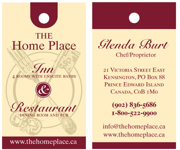
 Shown here is a business card designed for The Home Place. It offers country-gourmet-style dining in a Victorian setting which also houses a four-room inn. The owner/chef Glenda Burt identified the quality atmosphere she has built and nurtured and wanted that esthetic expressed with her card graphics and colours. This double-sided card is her selection from several design options. Looking at it, one would not expect it to be a place that serves fast food. The classic/traditional colours, clean serif and script fonts, and simple antique-style gimagery work together to speak visually about this business.
(The card also served as a display piece on a local business board. This required a vertical orientation and space to accommodate a .25 inch hole for hanging.)